Articles

MIU MIU
Highlight the MIU MIU bag with luxury and mystery within a cinematic scene
Process: Focused on the girl’s pose, lighting, and leather details to create a strong, balanced visual.
Used light and shadow contrast and precise texture highlighting to convey elegance and artistic depth.
A sleek cinematic poster presenting the bag as a symbol of strength and elegance, delivering a distinctive visual narrative.

Creative Design Agency
Presenting the graphic company’s services in a clear, modern, and uncluttered way
Organized key offerings and visuals into a simple, structured layout
Used clean design, balanced spacing, and strong visual hierarchy to highlight each service.
A polished, easy-to-read brochure that reflects the company’s creativity and professional identity.

HERMÈS
Showcasing the natural lizard-skin luxury without losing elegance or overwhelming the visual
Focused on lighting, angles, and texture details to emphasize the material’s richness
Used cinematic contrast and refined composition to highlight the bag’s craftsmanship and unique texture.
A sophisticated poster that reflects Hermès’ identity—luxurious, bold, and artistically crafted.

2026 color trend
Presenting similar 2026 colors clearly without clutter
Selected key shades and built a simple, clean layout
Used minimal design and organized color spacing
A clear, neat brochure that highlights 2026 colors easily.

PRADA
Creating a mysterious mood while keeping the PRADA bag visually dominant
Selecting cinematic elements that blend isolation and nostalgia
Using dim lighting, an abandoned street, and the girl emerging from an old TV to enhance the dramatic tone.
A striking poster that reflects PRADA’s identity with a mysterious atmosphere and places the bag at the center of the visual story.
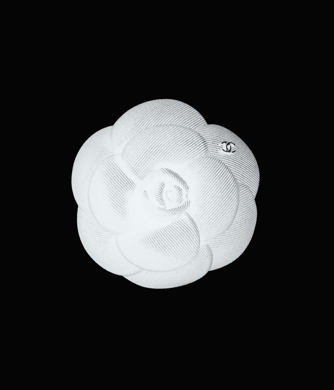
COCO CHANEL
Visual-first design with performance in mind
Merge e-commerce, brand story, and UX
Compress assets and reuse smart layout blocks
Bold, responsive store site with rich content
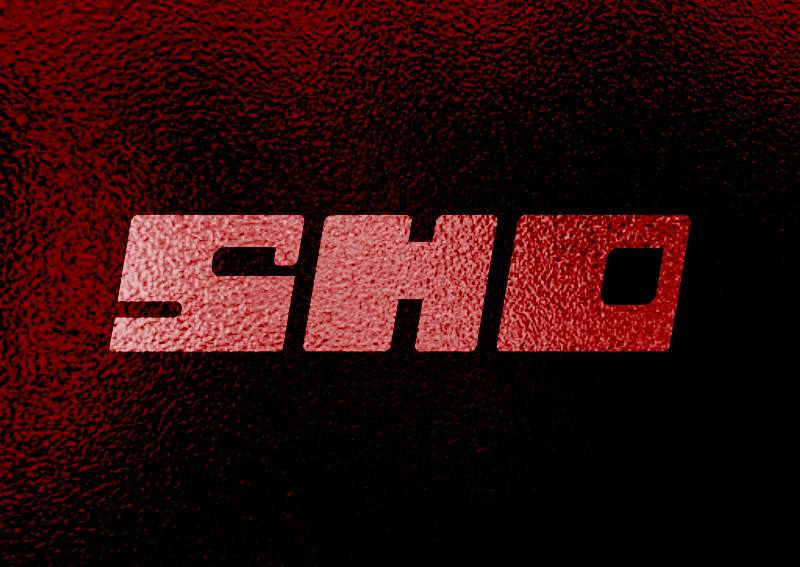
SHO
Creating a strong visual identity that feels unique and consistent across all brand elements
Designed the logo, brand style, packaging, and social media posts with a unified direction
Used cohesive visuals and clear branding to connect every digital and printed piece
A professional, recognizable brand identity that boosted the restaurant’s visibility online and offline.
PERFECT MATCH
Simplifying foundation-shade selection without overwhelming the customer
Breaking down undertone identification and shade testing into clear visual steps
Using clean icons, soft colors, and an organized layout for easy, quick understanding
A simple, clear brochure that helps users find their perfect match easily.

Rolexs
Balance animation with SEO and fast loading
Create a dynamic, concept-driven layout system
Use smooth motion with responsive consistency
Immersive site with strong brand identity